


Goal
Create a widget that will document the conversation an advisor had with a customer more efficiently and design for a summary advisors can trust.
Context
Internship at Spotify
Summer 2023

Problem Space
Contacting customer support can be a hit or miss for users. Still, we need to consider what the advisors are going through. I aimed to address the advisor's side of the equation. At Spotify, 280,000 monthly users seek assistance via web chat. Their work necessitated using over 30+ tools, leading to cognitive overload. This led me to focus on the Case Summary within the Advisor Desktop – a tool meant to streamline and enhance the advisors' experience.
The Case Summary serves two purposes:
- Maintaining the quality of customer support documentation and facilitating seamless case transfers between advisors.
- Advisors manually create these summaries, taking an average of 50 seconds per case, accumulating to nearly 4,400 hours monthly.
Outcome
With an immense opportunity for improvement, I embarked on an in-depth exploration.
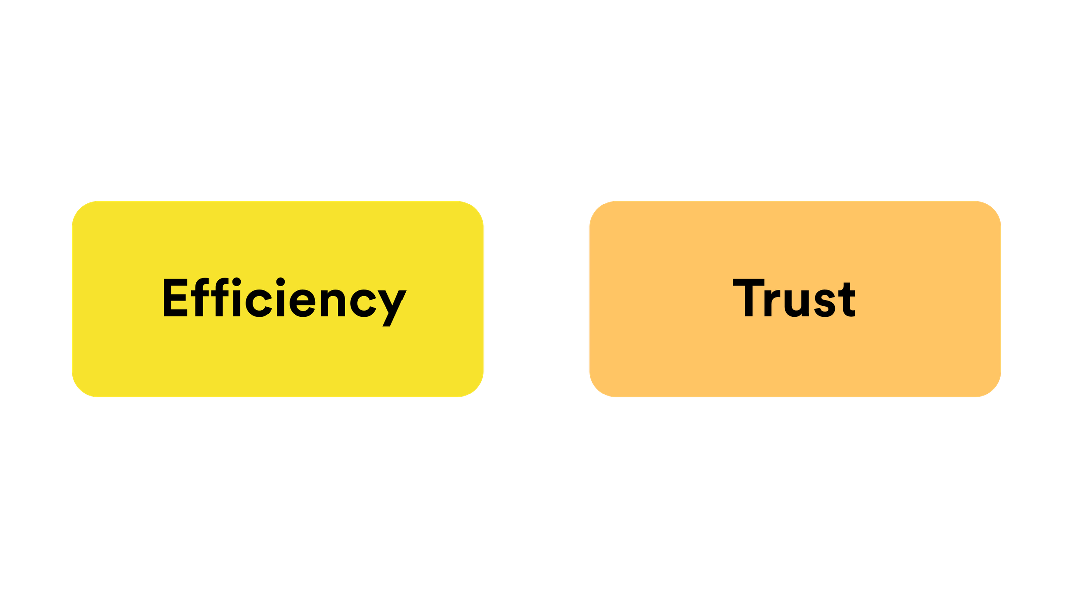
Two core values emerged: efficiency and trust.
Efficiency, optimizing time and resource utilization for advisors and users, and trust to ensure accurate and reliable information representation.
Guided by these values, my proposal centered on automating the summarization process using an OpenAI API, specifically ChatGPT. My solution aimed to optimize advisors' time while ensuring information accuracy, enhancing advisor productivity and user satisfaction. This proposal could cut the time advisor spends on the summary in half and save Spotify hella money each month.
Automatisation through ChatGPT API
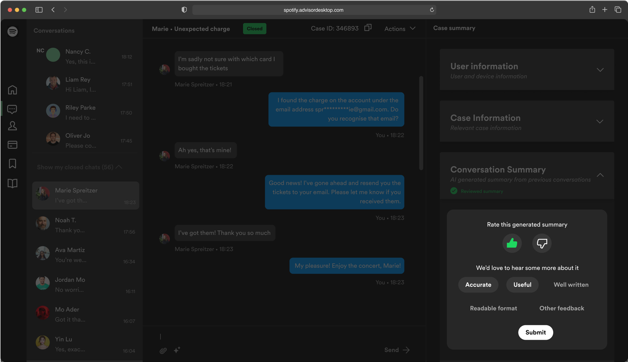
This feature strategically uses the power of automation, specifically through a ChatGPT API, to revolutionize the case summarization process. By utilizing artificial intelligence, we drive efficiency, freeing up valuable time for advisors to focus on resolving user issues promptly. Through quick and accurate automated summaries, advisors can rapidly grasp the context of ongoing conversations. This feature streamlines operations and reduces the cognitive load on advisors, ultimately enhancing their capacity to provide seamless support.
Easy Access to Information
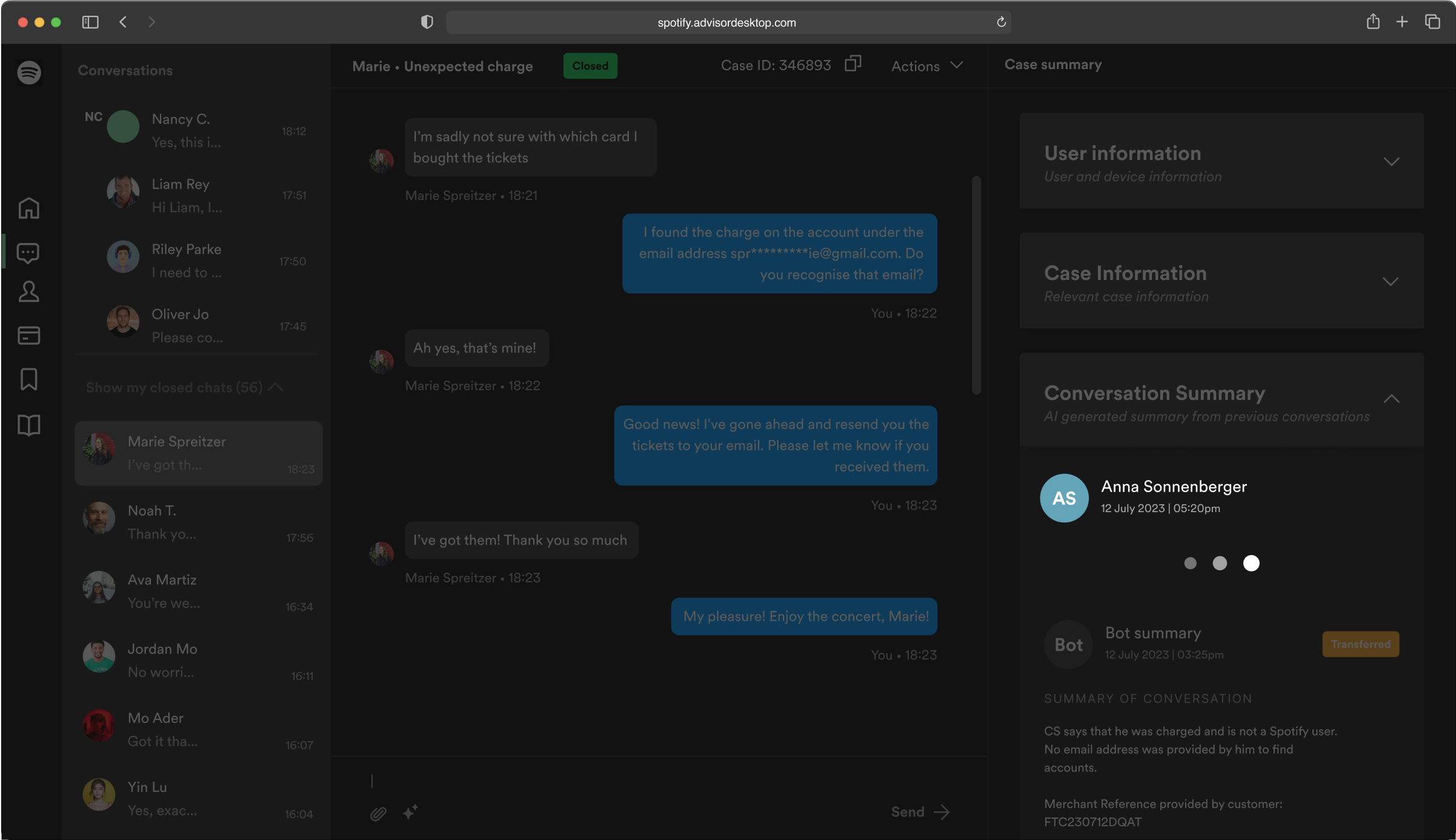
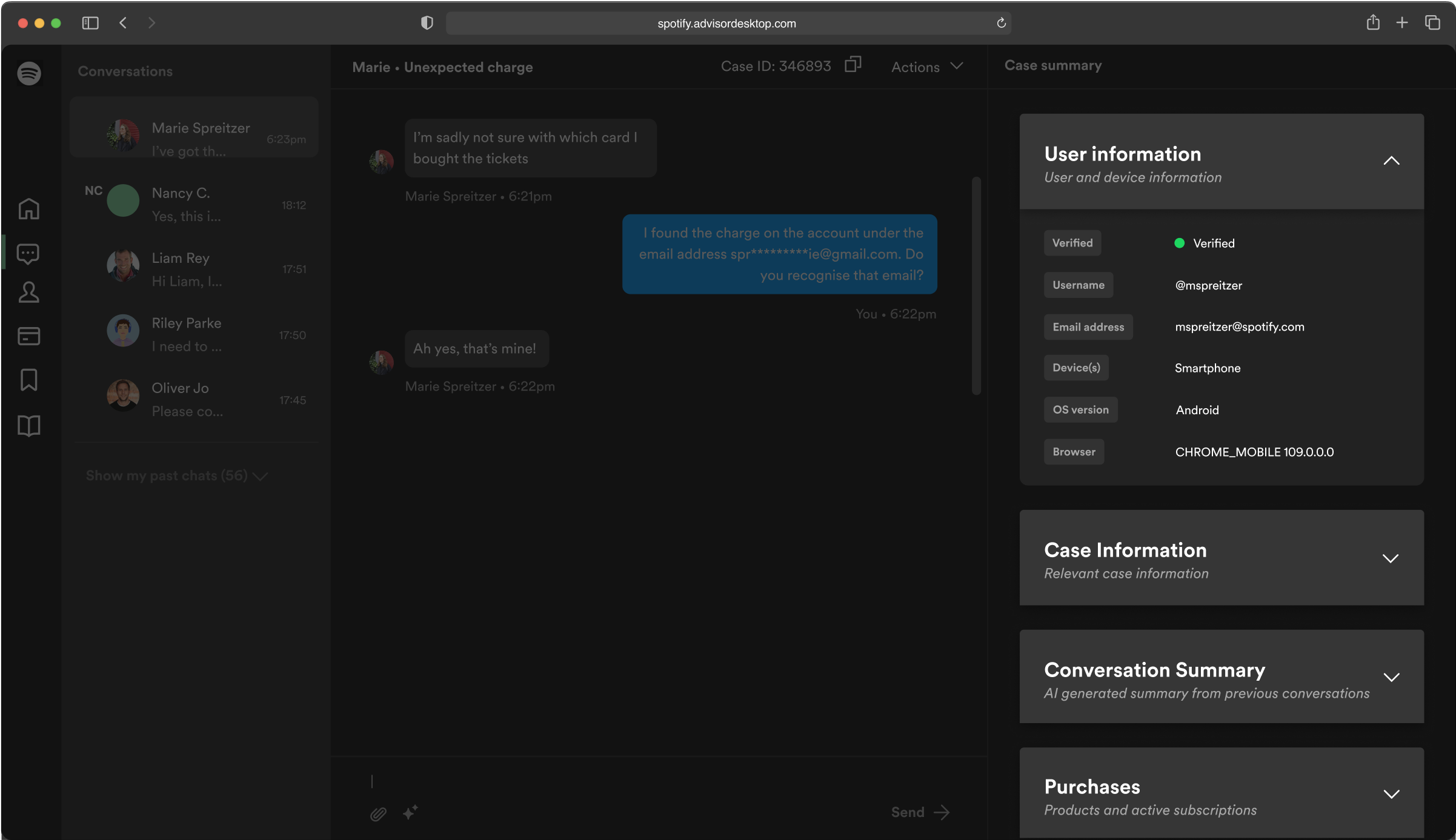
Efficiency takes center stage with this feature by organizing information using intuitive accordions. These collapsible sections systematically categorize user details, case specifics, conversation summaries, and purchase insights. Such an organization facilitates quick access to crucial data and fosters smoother navigation for advisors. Advisors can direct their energy toward delivering practical support by minimizing the effort required to locate essential information. This feature optimizes the workflow and enables advisors to work more intelligently.
Establish Trust through Reviews
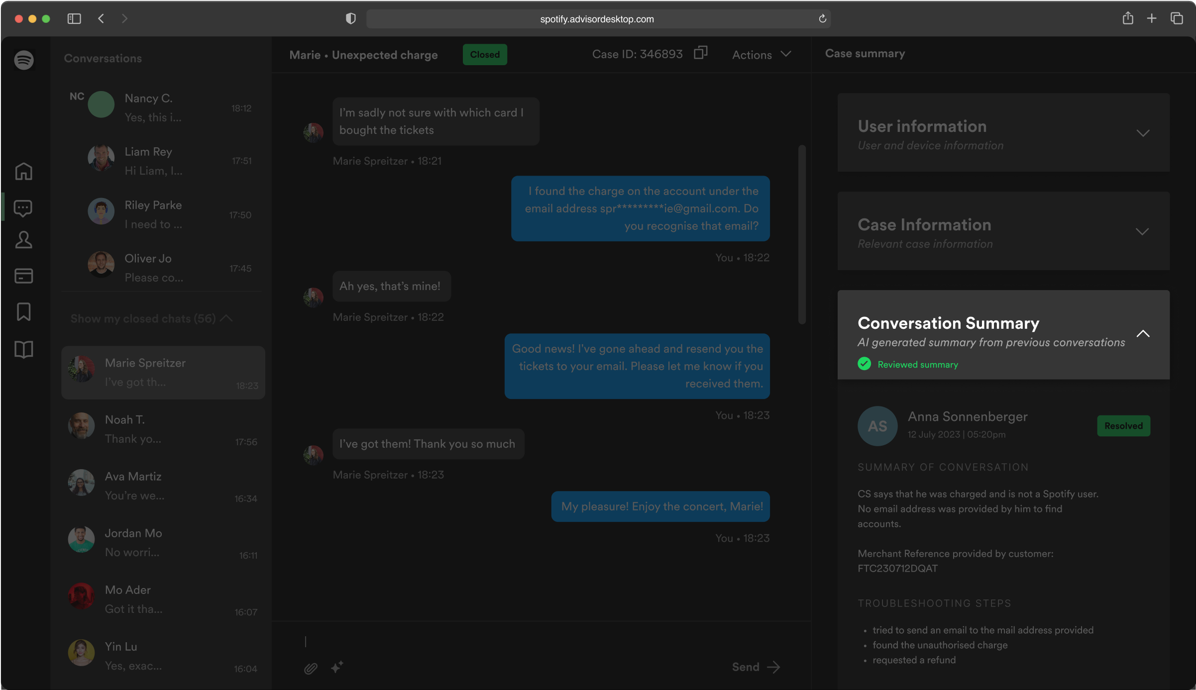
Trust is the cornerstone of this feature, allowing advisors to instill confidence in the case summaries they review. By marking reviewed outlines, advisors signal colleagues and supervisors that a human eye has validated the content. This transparency reinforces advisors' trust in the system's accuracy and their own contribution.
Advisors have the Last Say
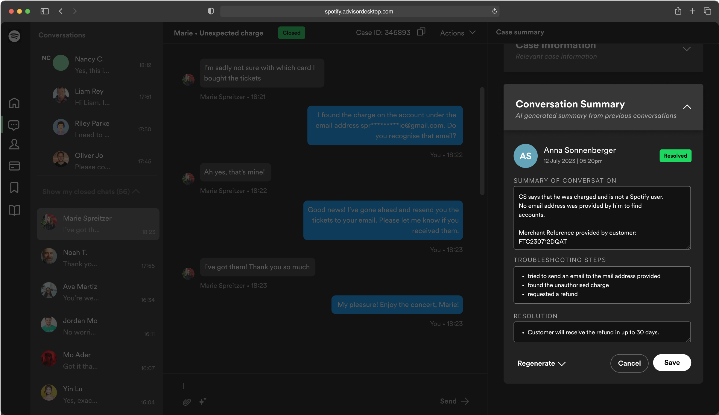
Incorporating a user-centric approach, this feature empowers advisors to refine summaries, enhancing both accuracy and trust. By allowing advisors to edit resumes, we encourage thoroughness and customization, ensuring the documented interactions accurately reflect the case nuances and their work. This level of control promotes confidence in the system's representation. It empowers advisors to be actively involved in shaping the outcome. In line with the values, this feature supports reliability while fostering a sense of ownership among advisors.
Continuously Improve Prompts with Feedback Loops
This feature embodies the commitment to constant enhancement, catering to efficiency and trust. We embrace the dynamic nature of support conversations by engaging advisors in an ongoing feedback loop to refine prompts. Advisors contribute their insights, enhancing ChatGPT's accuracy over time. This iterative process strengthens the AI's ability to generate summaries that resonate with advisors and users alike, reinforcing trust through reliable information and efficiency through the evolution of an increasingly effective tool.
Outcome
My Design Principles
Armed with these insights, I established fundamental design guidelines to drive my process forward. These guidelines encompassed:
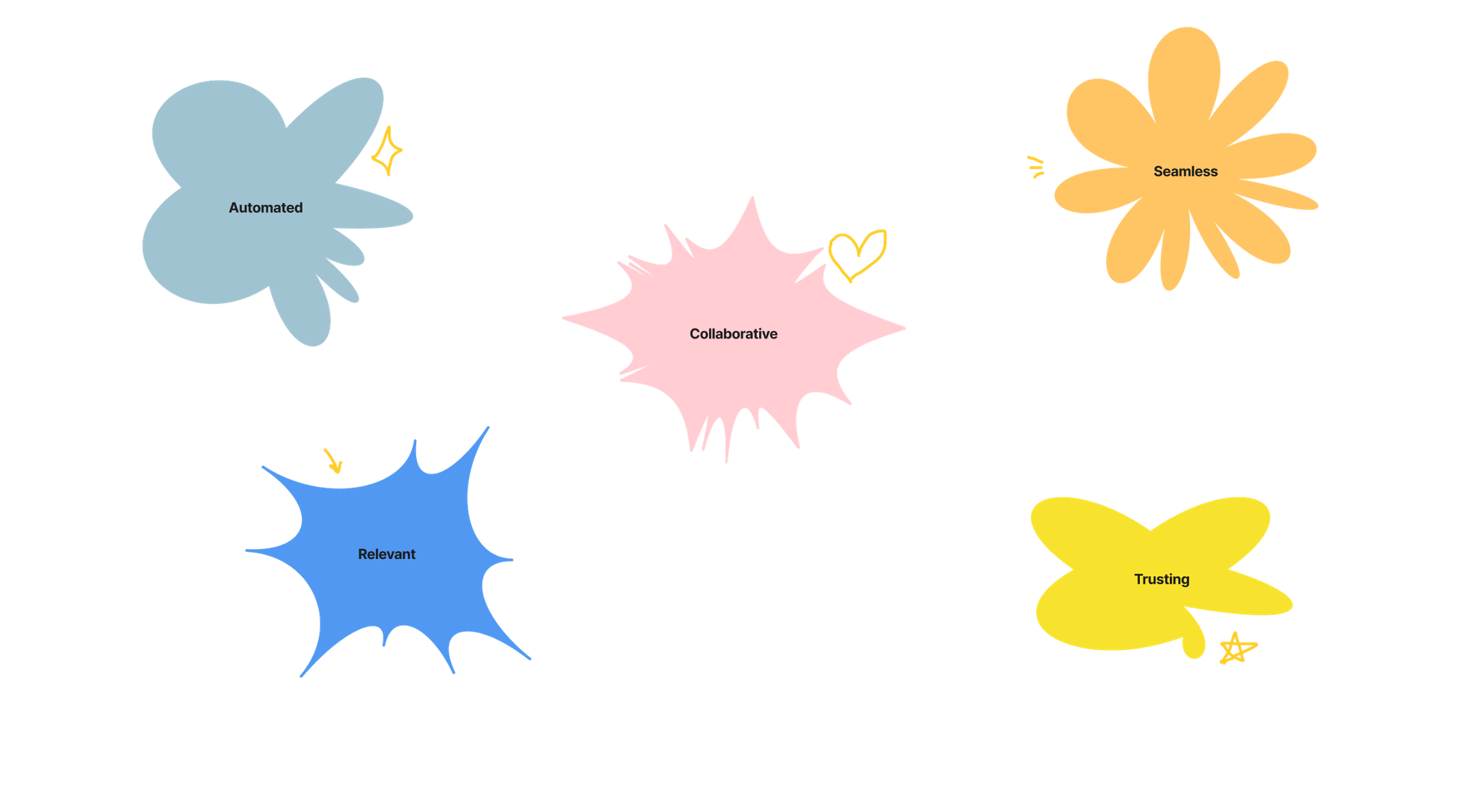
- Automated: Automate collection and summarization to minimize summary creation time.
- Relevant: Present only pertinent information to advisors.
- Collaborative: User reviews allow advisors to review and adjust summaries uniformly.
- Seamless: Ensure summaries are seamlessly accessible within cases.
- Trusting: Design for advisor confidence in summary accuracy.
Taking a Step Back
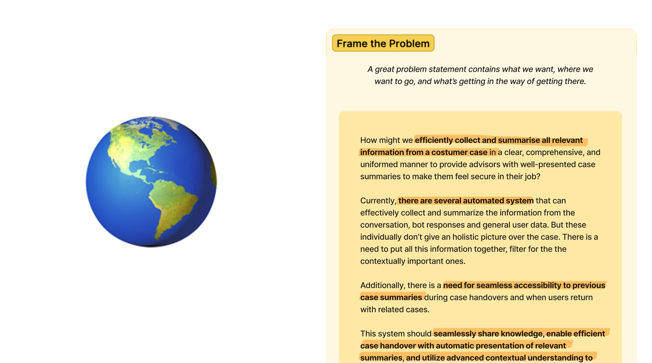
To validate the problem statement, I revisited the existing automated summary feature, considering whether it addressed the advisors' needs. I recognized that while automated systems can summarize parts of conversations, they lack a holistic overview of the case. What was required was a comprehensive approach that combined various data sources to contextualize the information.
Embracing a holistic outlook, I broadened the scope to encompass all case information, recognizing that the conversation summary was vital to a larger puzzle.
Designing for Values
Focused on efficiency and trust, I contemplated the values that drove my design choices.
Efficiency was twofold – saving advisors time and ensuring swift user assistance. Trust encompassed crafting summaries that advisors could rely on and comprehend.
With a clear direction, my guiding question emerged:
"How might we design a case summary that advisors can trust and that enhances their efficiency?"
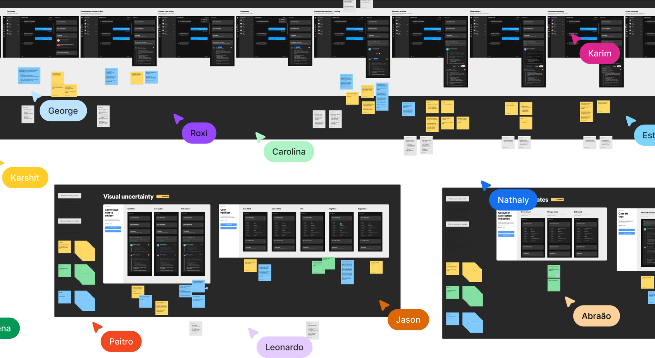
Jam Sessions with the Team
Moving forward, I made use of design to deliver trust and efficiency. I engaged my design team in collaborative sessions, ideating how to coherently display the summary information. We explored combining bot and advisor summaries, deploying accordions, creating a visual timeline, and the potential integration of a notepad for additional context.
Iterative design led to wireframes and high-fidelity screens. Seeking broader input, I shared prototypes through FigJam, receiving valuable feedback from various disciplines of the teams. This feedback encouraged me to simplify the design, focus on essential features that truly matter, and fix flaws in my thinking.
Considering the valuable feedback, I refined the UI designs, addressing interaction flow and optimizing the case closure process. Collaborating with colleagues, I fine-tuned the design, ensuring it aligned seamlessly with the trust and efficiency goals I set out to achieve.
Next Steps
The team is diving into another round of iterations on the advisor desktop's overarching information architecture. While this will impact the specifics and positioning of the case summary, the core functions remain largely autonomous. User testing becomes vital to evaluate the concept. Gathering qualitative insights from users will be instrumental in measuring its efficiency.
In evaluating the user experience, several key UX metrics deserve close examination:
- Time Invested: Observing the time to generate or compose the summary will illuminate its practicality.
- Interaction Efficiency: Tracking the clicks required to produce or write the summary unveils its streamlined accessibility.
- Summary Comprehension: Evaluating users' time to comprehend the summary gauges clarity and conciseness.
- User Satisfaction: Capturing user feedback on their contentment with the summary ensures that it meets their expectations.
This data-driven approach, supported by these UX metrics, will provide a comprehensive view of the case summary's effectiveness, steering its refinement in the most user-centric direction.
A Moment of Reflection
I've really come to terms with how design can be challenging. Sticking rigidly to a set design process doesn't work out in the real world. Instead, I've found that embracing the messiness of uncertainty and challenges is where the magic happens. Trusting in my skills, even when things are a bit chaotic. It's like realizing that tackling complex issues is just as important as having all the answers. Designing for values has been a rock, guiding me when things get uncertain.
I also tackled my doubts head-on, especially regarding visual design. I used to hold back, unsure of my abilities. But working closely with my supportive colleagues showed me the power of teaming up. Getting help wasn't a weakness. It was about growing together. Their advice has been my secret weapon in navigating tricky visual design waters. And speaking of teamwork, chatting with colleagues from different areas has opened my eyes to new perspectives. Cross-discipline collaboration has enriched my understanding of projects in a big way. It's like realizing that teamwork isn't limited to just one department – everywhere.
Lastly, I learned to always stay critical. Questioning things is vital to solving problems for real. I made it a habit to reject quick fixes that only scratch the surface. I repeatedly asked the same questions, ensuring our efforts were geared toward real solutions. It's like sifting through the noise to find what really matters.

Goal
Create a widget that will document the conversation an advisor had with a customer more efficiently and design for a summary advisors can trust.
Context
Internship at Spotify
Summer 2023

Problem Space
Contacting customer support can be a hit or miss for users. Still, we need to consider what the advisors are going through. I aimed to address the advisor's side of the equation. At Spotify, 280,000 monthly users seek assistance via web chat. Their work necessitated using over 30+ tools, leading to cognitive overload. This led me to focus on the Case Summary within the Advisor Desktop – a tool meant to streamline and enhance the advisors' experience.
The Case Summary serves two purposes:
- Maintaining the quality of customer support documentation and facilitating seamless case transfers between advisors.
- Advisors manually create these summaries, taking an average of 50 seconds per case, accumulating to nearly 4,400 hours monthly.
Outcome
With an immense opportunity for improvement, I embarked on an in-depth exploration.
Two core values emerged: efficiency and trust.
Efficiency, optimizing time and resource utilization for advisors and users, and trust to ensure accurate and reliable information representation.
Guided by these values, my proposal centered on automating the summarization process using an OpenAI API, specifically ChatGPT. My solution aimed to optimize advisors' time while ensuring information accuracy, enhancing advisor productivity and user satisfaction. This proposal could cut the time advisor spends on the summary in half and save Spotify hella money each month.
Automatisation through ChatGPT API
This feature strategically uses the power of automation, specifically through a ChatGPT API, to revolutionize the case summarization process. By utilizing artificial intelligence, we drive efficiency, freeing up valuable time for advisors to focus on resolving user issues promptly. Through quick and accurate automated summaries, advisors can rapidly grasp the context of ongoing conversations. This feature streamlines operations and reduces the cognitive load on advisors, ultimately enhancing their capacity to provide seamless support.
Easy Access to Information
Efficiency takes center stage with this feature by organizing information using intuitive accordions. These collapsible sections systematically categorize user details, case specifics, conversation summaries, and purchase insights. Such an organization facilitates quick access to crucial data and fosters smoother navigation for advisors. Advisors can direct their energy toward delivering practical support by minimizing the effort required to locate essential information. This feature optimizes the workflow and enables advisors to work more intelligently.
Establish Trust through Reviews
Trust is the cornerstone of this feature, allowing advisors to instill confidence in the case summaries they review. By marking reviewed outlines, advisors signal colleagues and supervisors that a human eye has validated the content. This transparency reinforces advisors' trust in the system's accuracy and their own contribution.
Advisors have the Last Say
Incorporating a user-centric approach, this feature empowers advisors to refine summaries, enhancing both accuracy and trust. By allowing advisors to edit resumes, we encourage thoroughness and customization, ensuring the documented interactions accurately reflect the case nuances and their work. This level of control promotes confidence in the system's representation. It empowers advisors to be actively involved in shaping the outcome. In line with the values, this feature supports reliability while fostering a sense of ownership among advisors.
Continuously Improve Prompts with Feedback Loops
This feature embodies the commitment to constant enhancement, catering to efficiency and trust. We embrace the dynamic nature of support conversations by engaging advisors in an ongoing feedback loop to refine prompts. Advisors contribute their insights, enhancing ChatGPT's accuracy over time. This iterative process strengthens the AI's ability to generate summaries that resonate with advisors and users alike, reinforcing trust through reliable information and efficiency through the evolution of an increasingly effective tool.
Outcome
My Design Principles
Armed with these insights, I established fundamental design guidelines to drive my process forward. These guidelines encompassed:
- Automated: Automate collection and summarization to minimize summary creation time.
- Relevant: Present only pertinent information to advisors.
- Collaborative: User reviews allow advisors to review and adjust summaries uniformly.
- Seamless: Ensure summaries are seamlessly accessible within cases.
- Trusting: Design for advisor confidence in summary accuracy.
Taking a Step Back
To validate the problem statement, I revisited the existing automated summary feature, considering whether it addressed the advisors' needs. I recognized that while automated systems can summarize parts of conversations, they lack a holistic overview of the case. What was required was a comprehensive approach that combined various data sources to contextualize the information.
Embracing a holistic outlook, I broadened the scope to encompass all case information, recognizing that the conversation summary was vital to a larger puzzle.
Designing for Values
Focused on efficiency and trust, I contemplated the values that drove my design choices.
Efficiency was twofold – saving advisors time and ensuring swift user assistance. Trust encompassed crafting summaries that advisors could rely on and comprehend.
With a clear direction, my guiding question emerged:
"How might we design a case summary that advisors can trust and that enhances their efficiency?"
Jam Sessions with the Team
Moving forward, I made use of design to deliver trust and efficiency. I engaged my design team in collaborative sessions, ideating how to coherently display the summary information. We explored combining bot and advisor summaries, deploying accordions, creating a visual timeline, and the potential integration of a notepad for additional context.
Iterative design led to wireframes and high-fidelity screens. Seeking broader input, I shared prototypes through FigJam, receiving valuable feedback from various disciplines of the teams. This feedback encouraged me to simplify the design, focus on essential features that truly matter, and fix flaws in my thinking.
Considering the valuable feedback, I refined the UI designs, addressing interaction flow and optimizing the case closure process. Collaborating with colleagues, I fine-tuned the design, ensuring it aligned seamlessly with the trust and efficiency goals I set out to achieve.
Next Steps
The team is diving into another round of iterations on the advisor desktop's overarching information architecture. While this will impact the specifics and positioning of the case summary, the core functions remain largely autonomous. User testing becomes vital to evaluate the concept. Gathering qualitative insights from users will be instrumental in measuring its efficiency.
In evaluating the user experience, several key UX metrics deserve close examination:
- Time Invested: Observing the time to generate or compose the summary will illuminate its practicality.
- Interaction Efficiency: Tracking the clicks required to produce or write the summary unveils its streamlined accessibility.
- Summary Comprehension: Evaluating users' time to comprehend the summary gauges clarity and conciseness.
- User Satisfaction: Capturing user feedback on their contentment with the summary ensures that it meets their expectations.
This data-driven approach, supported by these UX metrics, will provide a comprehensive view of the case summary's effectiveness, steering its refinement in the most user-centric direction.
A Moment of Reflection
I've really come to terms with how design can be challenging. Sticking rigidly to a set design process doesn't work out in the real world. Instead, I've found that embracing the messiness of uncertainty and challenges is where the magic happens. Trusting in my skills, even when things are a bit chaotic. It's like realizing that tackling complex issues is just as important as having all the answers. Designing for values has been a rock, guiding me when things get uncertain.
I also tackled my doubts head-on, especially regarding visual design. I used to hold back, unsure of my abilities. But working closely with my supportive colleagues showed me the power of teaming up. Getting help wasn't a weakness. It was about growing together. Their advice has been my secret weapon in navigating tricky visual design waters. And speaking of teamwork, chatting with colleagues from different areas has opened my eyes to new perspectives. Cross-discipline collaboration has enriched my understanding of projects in a big way. It's like realizing that teamwork isn't limited to just one department – everywhere.
Lastly, I learned to always stay critical. Questioning things is vital to solving problems for real. I made it a habit to reject quick fixes that only scratch the surface. I repeatedly asked the same questions, ensuring our efforts were geared toward real solutions. It's like sifting through the noise to find what really matters.